Weekly Design Bites
Drive By Feng Shui
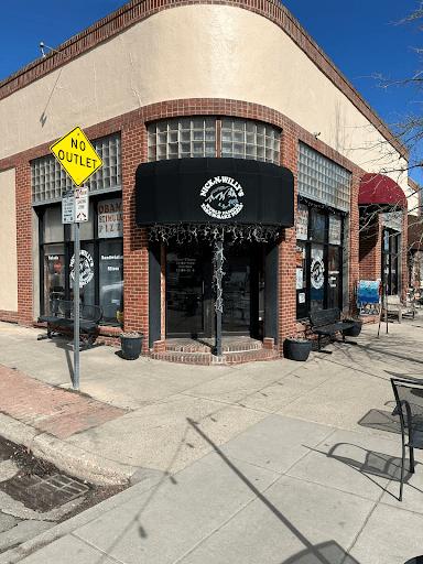
I am traveling this week and walked by Nick N Willy’s Pizza in Boulder, CO. It is such a cute place and I couldn’t help but look at it with my Feng Shui googles on…
POSITIVE:
A safe, curved approach and steps with matching curved awning, glass block and stucco—great for a commercial space on a corner.
Excellent pizza, of course. 😄
IMPROVEMENTS:
Hard to read logo—too busy (can’t read from the street).
Vertical post in the middle of the entryway (energetically and practically dividing left and right-need to make a decision to enter)
Dark outside colors (black awning, trim and doors).
Messy and broken decor (x-mas lights hanging too low, dead plants in planters, broken concrete and crumbly brick tuck pointing).
Feng Shui-IT!
Easy to read and see logo! Hot orange/red lettering to complement the brick color 🧱
Simplify logo—make it easy to read from the street
Yummy olive 🫒 green exterior paint and awning colors—instead of black—to compliment the brick and (new) logo!
Remove blocking middle post - no decision…pizza it is! 🍕
Add life to the plant containers 🌱 (pssst…They can even be faux plants in winter or pine trees to complement the exterior color)
Repair concrete and brick work at the sidewalk level
Remove lights to free up head space; no need to duck in.
That's all for now -- next week we'll be back in Wisconsin and look forward to sharing more of our Feng Shui projects with you!
Till my next love note…
XOXO

© 2026 Jane Antonovich Designs

I'm Jane Antonovich — Feng Shui Designer, Professional Organizer, and the person who will walk into your home and see everything it's been doing to your life that you've been completely blind to. (Don't worry — I say that with love.) For over 15 years, I've helped hundreds of clients transform their spaces — and watched their careers, relationships, health, and sense of aliveness transform right along with them. Because that's what happens when your home stops working against you and starts working for you. If you're new here, the best place to start is the free Home Assessment Quiz — it'll tell you exactly where your home's energy is either supporting or sabotaging you, and what to do about it.
Take the Quiz:
Schedule a Complimentary Call:
JANE ANTONOVICH DESIGNS

© 2025 Jane Antonovich Designs
All Rights Reserved
Website Designed, Written & Created by Stephanie McWilliams